You are not logged in.
- Topics: Active | Unanswered
#1 2023-05-09 04:06:49
- JmaCWQ
- Member
- Registered: 2022-12-06
- Posts: 55
[SOLVED] Line Shading in Thunar List View?
Hello All,
I'm trying to get the window background in Thunar 4.18.3 to have a different colour for each line when viewing folders in List view.
Makes it a lot easier on the eyes when viewing.
In the Xfe file manager it's referred to as File List Background Colour and File List Highlight Colour.
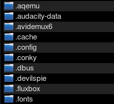
Like this:
Currently no matter what theme I use, in Thunar it's like this:
I found this thread by CwF - https://forum.xfce.org/viewtopic.php?id=15537
Has the option to do what I'm wanting to do been removed as stated there?
Or does that thread refer to something else?
Thanks
Last edited by JmaCWQ (2024-07-20 11:36:13)
Offline
#2 2023-05-09 05:04:12
- ToZ
- Administrator
- From: Canada
- Registered: 2011-06-02
- Posts: 11,816
Re: [SOLVED] Line Shading in Thunar List View?
Has the option to do what I'm wanting to do been removed as stated there?
Yes. See: https://gitlab.gnome.org/GNOME/gtk/-/issues/581.
You can add hover highlight as an option, though its not exactly the same functionality. Something like:
.thunar notebook treeview.view:hover { background-color: #232323; }Last edited by ToZ (2023-05-09 05:11:36)
Mark solved threads as [SOLVED] to make it easier for others to find solutions.
--- How To Ask For Help | FAQ | Developer Wiki | Community | Contribute ---
Offline
#3 2023-05-09 06:31:59
- JmaCWQ
- Member
- Registered: 2022-12-06
- Posts: 55
Re: [SOLVED] Line Shading in Thunar List View?
Thanks again Toz,
That does help, now I know definitely and easily at a glance which line I'm looking across.
Because while zebra/even-odd row styling is useful on printed list, it has no verifiable benefit when it comes to the readability of lists on a screen.
That opinion I cannot agree with, might be ok with young eyes I guess, but as one ages things like that can be of great benefit viewing on a screen.
Disappointing they removed it but I can understand why if it was breaking things.
Perhaps I can somehow stumble across a way to use an image for the file list background, I see in the theme's .css files other elements of the theme use a background image, not just a colour as the file list background now seems to.
Offline
#4 2023-05-09 12:39:55
- ToZ
- Administrator
- From: Canada
- Registered: 2011-06-02
- Posts: 11,816
Re: [SOLVED] Line Shading in Thunar List View?
Perhaps I can somehow stumble across a way to use an image for the file list background, I see in the theme's .css files other elements of the theme use a background image, not just a colour as the file list background now seems to.
Something like:
.thunar .standard-view .view {
 background-image: -gtk-scaled(url("/home/toz/Pictures/gm.jpg"), url("/home/toz/Pictures/gm@2.jpg"));
 background-repeat: no-repeat;
 background-position: bottom right;
}
.thunar .standard-view .view * {background-image: none;}
.thunar .standard-view .view * {background-color: rgba(0,0,0,0);}
Make sure to change the image to suit and make sure it is not too large/complex or it will drag your system down.
Mark solved threads as [SOLVED] to make it easier for others to find solutions.
--- How To Ask For Help | FAQ | Developer Wiki | Community | Contribute ---
Offline
#5 2023-05-15 11:35:14
- JmaCWQ
- Member
- Registered: 2022-12-06
- Posts: 55
Re: [SOLVED] Line Shading in Thunar List View?
Something like:
.thunar .standard-view .view {
 background-image: -gtk-scaled(url("/home/toz/Pictures/gm.jpg"), url("/home/toz/Pictures/gm@2.jpg"));
 background-repeat: no-repeat;
 background-position: bottom right;
}
.thunar .standard-view .view * {background-image: none;}
.thunar .standard-view .view * {background-color: rgba(0,0,0,0);}
Make sure to change the image to suit and make sure it is not too large/complex or it will drag your system down.
Using a variation of that I can get it very close to how I want using 2 images that are 1920x13 pixels each.
Not exactly like the setting in Xfe does that's pictured above, but somewhat usable.
I can't seem to get it to have one line grey and the other black at the smallest the icons can zoom out to, it will work with them larger but then they are too big.
When enabling this I lose the selection background colour for files and folders.
The file/folder text lightens as it should when selected, though the rest remains unchanged.
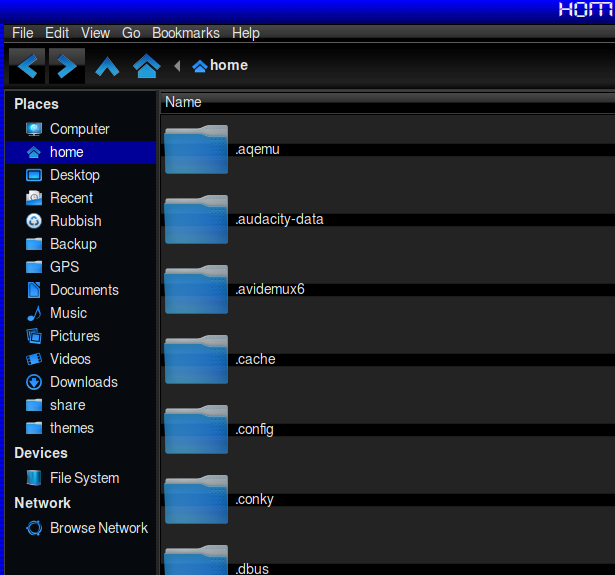
It should be blue like the home folder on the left in the pic below.
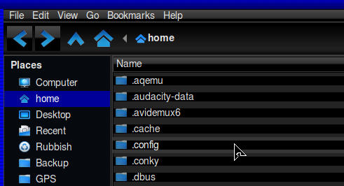
The folder .config is selected, text is lighter, the double grey lines are the hover highlight when it's split in the middle by the black image, which is so far the only way I've been able to get it to look sort of ok.
I would prefer one line black and one line grey if possible.
When I first tried the orignal .css entry it would only use the 2nd image in the line with the 2 url's, ignoring the first for some reason, and the whole background would be grey only, regardless of zoom settings.
And as well as losing the selected file/folder background colour it also lost the hover prelight and the images used for the column headers.
.thunar .standard-view .view {
 background-image: -gtk-scaled(url("/home/home/Pictures/Panels/lines-black.jpg"), url("/home/home/Pictures/Panels/lines-grey.jpg"));
 background-repeat: no-repeat;
 background-position: bottom right;
}
.thunar .standard-view .view * {background-image: none;}
.thunar .standard-view .view * {background-color: rgba(0,0,0,0);}
After experimenting for a couple of hours with different image combinations, sizes and different .css entries I ended up with this below using one 1920x13 black image and one 1920x13 grey image.
Combined with the.css gives the results shown in the pics:
.thunar .standard-view .view {
 background-image: -gtk-scaled(url("/home/home/Pictures/Panels/lines-black.jpg"), url("/home/home/Pictures/Panels/lines-grey.jpg"));
 background-repeat: no-repeat;
 background-position: center;
}
.thunar .standard-view .view * {background-image: (url("/home/home/Pictures/Panels/lines-black.jpg"), url("/home/home/Pictures/Panels/lines-grey.jpg"));}
.thunar .standard-view .view * {background-color: rgba(0,0,0,0);}
With that the hover prelight and image in the column headers work as expected, just the selected background colour doesn't work.
If I swap the image positions around in that .css text by putting the grey images before the black images in each line, it shows no black at all for some reason, only different shades of grey.
Of if I make the 4 image entries the black images it shows like the pic below, black and grey.
No matter what the positions of the grey and black folders in the .css text, it doesn't change the colour of the empty part of the folder and line (possibly a side effect of using images for backgrounds) when there's only a few things in a folder, I would have preferred the empty space to be all black though.
No matter what combination I tried it's only the grey that expands/shrinks between the files when I zoom in or out.
I guess something in the theme in use is messing with or overriding some of the things in the config's gtk-3.0/.css.

Zoomed in:
EDIT: I just tried other themes and the selected file/folder background colour doesn't work on any of them.
Last edited by JmaCWQ (2023-05-15 11:45:49)
Offline
#6 2024-07-20 07:38:56
- JmaCWQ
- Member
- Registered: 2022-12-06
- Posts: 55
Re: [SOLVED] Line Shading in Thunar List View?
Revisited this again after some time ignoring it, or trying to  , as I find it much easier to see the distinction between files with the different coloured shading, and don't like using anything but Thunar as a file manager.
I managed to figure out how to get the selected background the colour I want and this time I'm happy with the results except for one thing, I cannot get the selected text colour to change as desired.
I want it to show as #be0000 when a file or folder is selected, currently it seems to follow the theme settings and goes to #ffffff, but changing the settings in the theme's .css files doesn't seem to work and it stays the same regardless of what I put in ~/config/gtk-3.0/gtk.css
Anyone know what I'm doing wrong?
~/config/gtk-3.0/gtk.css
/*set custom gtk3/css code below */

@import url("whisker-tweak.css");
.thunar notebook treeview.view:hover { background-color: #004e00; }
.thunar .standard-view .view:selected {background-color: #000098}
.thunar .standard-view .view:selected {foreground-color: #be0000}

.thunar .standard-view .view {
 background-image: -gtk-scaled(url("/home/home/Pictures/Panels/lines-grey-darker.jpg"), url("/home/home/Pictures/Panels/lines-black.jpg"));
 background-repeat: no-repeat;
 background-position: center;
}
.thunar .standard-view .view * {background-image: (url("/home/home/Pictures/Panels/lines-grey-darker.jpg"), url("/home/home/Pictures/Panels/lines-black.jpg"));}
.thunar .standard-view .view * {background-color: rgba(0,0,0,1);}
I've tried
.thunar .standard-view .view:selected {foreground-color: #be0000}
.thunar .standard-view .view:selected {fg-color: #be0000}
.thunar .standard-view .view:selected {text-color: #be0000}
none of which work
Thanks
Offline
#7 2024-07-20 11:11:18
- ToZ
- Administrator
- From: Canada
- Registered: 2011-06-02
- Posts: 11,816
Re: [SOLVED] Line Shading in Thunar List View?
Instead of:
.thunar .standard-view .view:selected {foreground-color: #be0000}...try:
.thunar .standard-view .view treeview:selected {color: #be0000}Mark solved threads as [SOLVED] to make it easier for others to find solutions.
--- How To Ask For Help | FAQ | Developer Wiki | Community | Contribute ---
Offline
- Registered users online in this topic: 0, guests: 1
- [Bot] ClaudeBot
[ Generated in 0.012 seconds, 7 queries executed - Memory usage: 589.47 KiB (Peak: 606.31 KiB) ]


