You are not logged in.
- Topics: Active | Unanswered
Pages: 1
#1 2021-12-06 16:48:00
- lolailo
- Member
- Registered: 2021-12-06
- Posts: 1
clearer graphic
Hello.
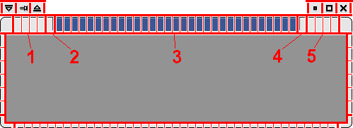
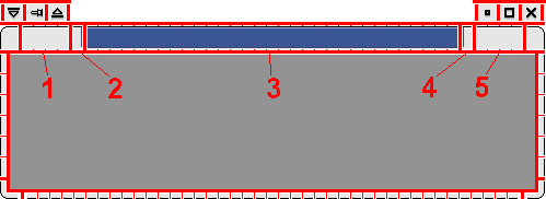
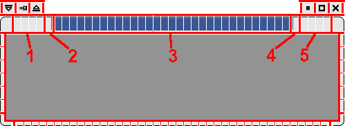
I found a little difficult to understand how an xfwm theme works because the graphic on that WIKI page is not clear at all. I don't know if this is the proper place to post this but anyway here it is if you consider is an improvement:


cheers.
Offline
#2 2021-12-06 23:42:56
- ToZ
- Administrator
- From: Canada
- Registered: 2011-06-02
- Posts: 11,815
Re: clearer graphic
Hello and welcome.
Thanks for the comment. The original graphic is actually accurate in that to design the elements that you are identified, the pixmap responsible for that section is actually used multiple times depending on the width of the titlebar or the number of elements in the corner section. So it is programmatically correct, but as you pointed out, it might not be accurate from a visual/design perspective.
Would a statement of some kind near that graphic help to explain this? If so, what would you suggest?
Mark solved threads as [SOLVED] to make it easier for others to find solutions.
--- How To Ask For Help | FAQ | Developer Wiki | Community | Contribute ---
Offline
Pages: 1
- Registered users online in this topic: 0, guests: 1
- [Bot] ClaudeBot
[ Generated in 0.012 seconds, 8 queries executed - Memory usage: 522.43 KiB (Peak: 523.27 KiB) ]